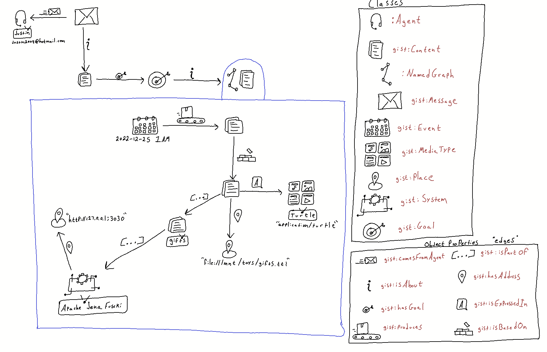
Intuitive Graph Viz

- https://github.com/justin2004/weblog/tree/master/intuitive_graph_viz#readme
- written-by: @justin-dowdy
Highlights
I think KG viz today is dissapointing because:
(1) they mostly using circles and lines
(2) the layout algorithms (radial, circular, force-directed, etc.) are unaware of what the edges and node types mean
(3) they don't have a way to downsample (when rendering a large graph) while preserving the spirit of the meaning of the data
Thoughts
References
Backlinks